# Module
When developing an application, it is essential to streamline the process by reusing components and queries across multiple applications. This can be achieved through the use of modules, which are a combination of components and queries. These modules can be easily integrated into various applications or other modules, which are referred to as external applications in the context of this discussion.
{% hint style="info" %}
Refer to [Your Modules](https://docs.appizap.ae/appizap-dashboard/your-modules) for more information on how to create new modules.
{% endhint %}
By incorporating a module into an application or other modules, it can operate seamlessly as a single component within the overall framework.
## Module basics
### Create a new module
### Configure module settings
You can configure a module's settings in the **Settings** tab of data browser:
* **Input**: parameters passed into the current module from external apps.
* **Output**: data exposed to external apps.
* **Method**: methods exposed to external apps. For example, you can define a module with a `resetTitle` method, so that external apps can call it to reset the module's title.
* **Event**: module events can be handled by external apps. For example, you can define an event named `dataChanged`, so that external apps can add event handlers to it once the `dataChanged` event is fired by the module.
For more details, check out chapter [Module settings](#module-settings).
### Design module UI
The other areas of the module editor are similar to those of the web app editor. Insert components and create queries the same way as your app-building process. In the module editor, you can resize a module by dragging the bottom-right corner to the desirable default size. Toggle the button in the **Properties** panel to control whether the **component height scales with the container**.
{% hint style="info" %}
This only works for the fixed-height components within the module.
{% endhint %}
### Insert module to apps or other modules
When editing an app or module, select **Insert > Extensions > Modules** to display the modules that you have access to.
Then drag and drop the module onto the canvas, and set input parameters, change styles inside the module's **Properties** panel.
Inspect the data exposed by the module in the data browser.
## Module settings
### Input
Module inputs are parameters passed to the module from external apps. The supported input types are **data**, **string**, **number**, **array**, b**oolean**, and **query**. The first five are data types. Choose **data** to not restrict it to a specific data type. When choosing the type of **query**, you can pass in a query from external apps and trigger it inside the module, then you can reference a module input parameter by its **name**.
## Demo: A statistics module
This section guides you through the steps to build a statistics module and reuse it in an app.
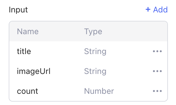
1. Create module inputs:
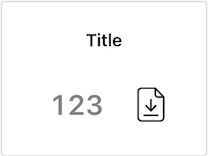
In the **Settings** tab, click **+** **Add** to create a new module input, and then set its **name**, **type**, **default value** (optional) and **tooltip** (optional). In this example, three module inputs are added: two string inputs `title`, `imageUrl`, and a number input `count`:
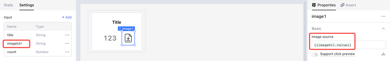
2. Design the module UI:
1. Insert a **container** into the module.
2. Add two **text** components and an **image** component to the container.
3. Adjust their properties, such as the layout, height, and style.
3. Bind the components' value to the module inputs. For example, the **Image source** of the image is bound to input parameter `imageUrl.value`.
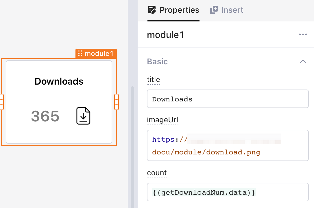
4. Insert the newly built module into an external app or module, and you can pass in values to configure its properties.
5. Reuse the module multiple times by passing different input values.
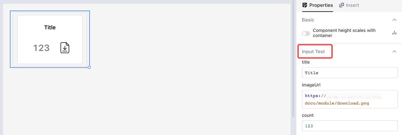
#### Input Test
To quickly test the effectiveness of input parameters during editing a module, you can use the **Input Test** function. In the **module editor**, select the whole module to conduct tests with simulated input data in the **Properties** panel. In the example previously mentioned, you can set the test values for the three module inputs: `title`, `imageUrl`, and `count`, as shown below:
### Output
Module outputs are the data exposed to an app or other modules. You can inspect the outputs of a module in the data browser and access them via JavaScript code in `{{ }}`.The following example shows the outputs in a user-filtering module.
Then you can check out and reference the outputs of a module in apps or other modules using it.
```sql
select * from public.users
where phone like {{’%’ + userFilterModule.tel + ‘%’}}
```
### Method
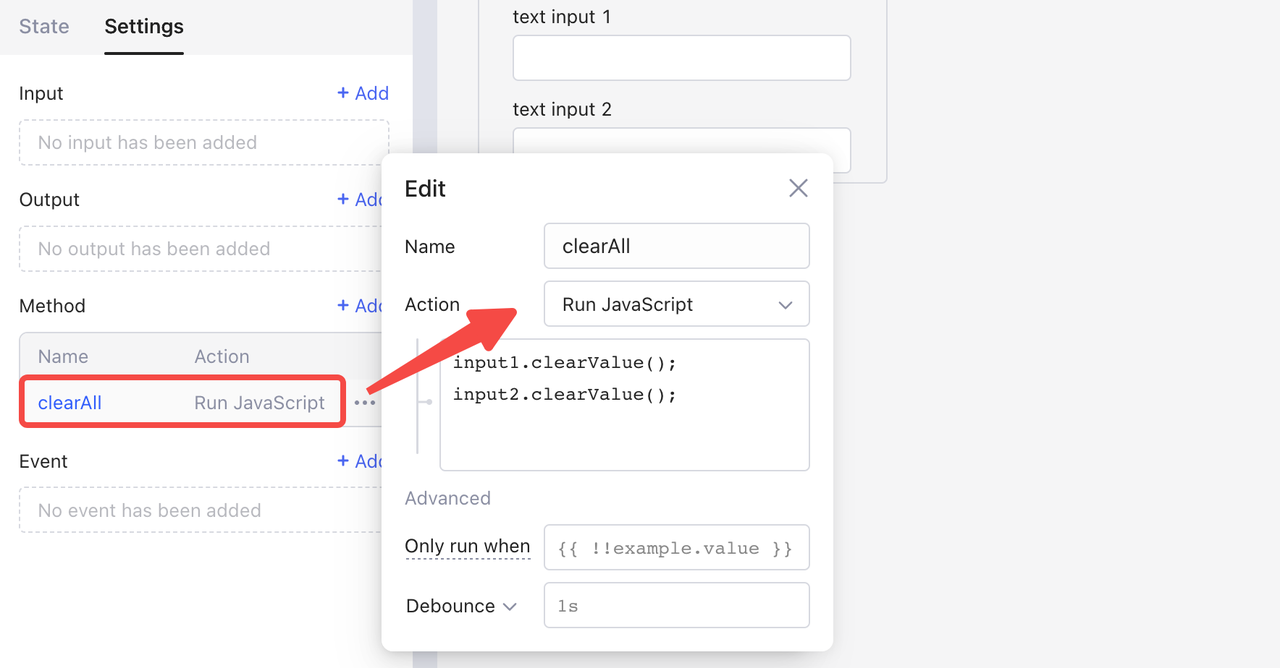
#### Add a new method
In the **Settings** tab, click **+** **Add** to create a new module method. Click the method to rename it and select an action. In the following example, the method `clearAll` is designed to clear the content in both input boxes. To achieve this, select **Run JavaScript** as the action, and write JS code to call the `clearValue` method of both two input components.
{% hint style="warning" %}
When creating a method for a module, you cannot create input parameters for the method and can only reference parameters within the scope of the current module.
{% endhint %}
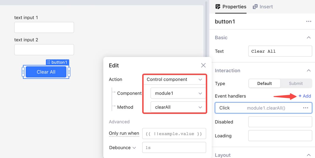
#### Call a method
When using modules, you can call a module method in two ways:
* In event handlers, select **Action** > **Control component**, and then select the **component** and **method**.
* Use dot notation in JavaScript queries. For example, `module1.clearAll()` calls the method `clearAll()` of `module1`.
#### Method Test
You can simulate testing method calling in the **Method Test** function.
### Event
Events are used to transfer signals from a module to external apps, such as defining `orderPlaced` `OrderModified` events for an order management module. You can add and fire events within a module, and deal with them using [event-handlers](https://docs.appizap.ae/build-apps/event-handlers "mention") externally.
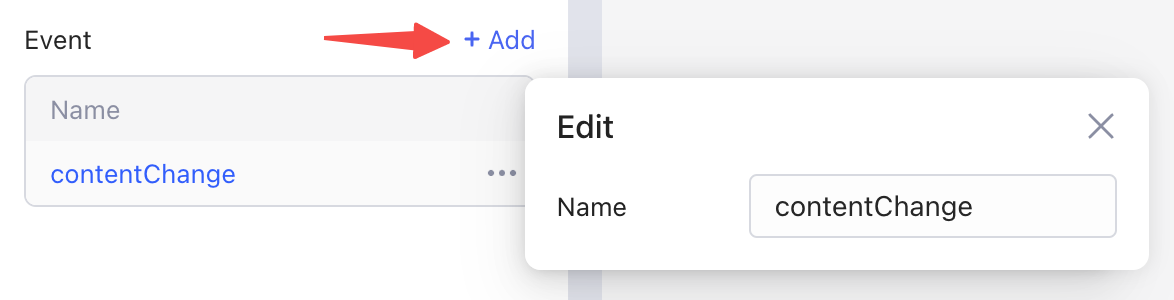
#### Add a new event
In the **Settings** tab, click **+** **Add** to create a new module event. Click the event to set its name.
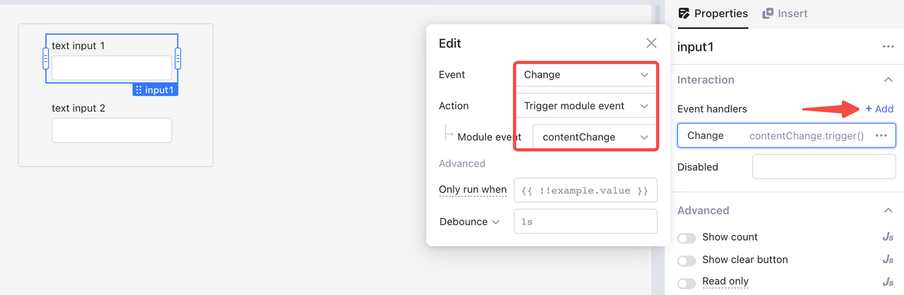
#### Trigger an event
In the following example, the event `contentChange` is triggered when the content in any input box changes. You can trigger it in two ways:
* In **Event handlers** of both input components, click **+ Add**, select **Change** as the component event and **Trigger module event** as the action, and finally select the module event `contentChange`.
* Use dot notation in JavaScript queries: `contentChange.trigger()`.
#### Event handlers
When an app uses a module, you can configure how the current app reacts to the module's events. For example, in **Event handlers** of `module1`, click **+ Add**, and select the module event `contentChange`and the action **Show notification**.
## Permissions
Users are given access to different modules within applications based on their permissions. As an editor, in order to utilize modules in external applications, you must have at least the viewer role for that specific module. This ensures that users have the appropriate level of access to view and interact with the necessary modules.
## Releases and versions
Appizap stores the history versions of your modules for your references. Click **Preview > Publish** at the top right. The release management of a module is identical to that of an app. For detailed information, see [#release-management](https://docs.appizap.ae/build-apps/version-and-release-management#release-management "mention")
{% hint style="info" %}
For an unpublished module, the apps and modules use its latest version; while for a published one, you need to publish it again to sync your latest changes.
{% endhint %}
---
# Agent Instructions: Querying This Documentation
If you need additional information that is not directly available in this page, you can query the documentation dynamically by asking a question.
Perform an HTTP GET request on the current page URL with the `ask` query parameter:
```
GET https://docs.appizap.ae/build-apps/app-editor/module.md?ask=
```
The question should be specific, self-contained, and written in natural language.
The response will contain a direct answer to the question and relevant excerpts and sources from the documentation.
Use this mechanism when the answer is not explicitly present in the current page, you need clarification or additional context, or you want to retrieve related documentation sections.
.png?alt=media)