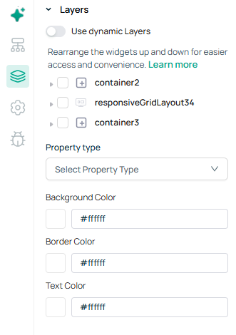
Appizap
  • Appizap Overview
  • Build Apps
    • On-boarding Flow
    • Ideas to Apps using AI
    • Create a new app
    • App Configuration
      • App Overview
      • General Settings
      • Domain Settings
      • Version Release & Management
      • App Assets
      • Auth Settings
    • UI Builder
      • Module
      • Menu Navigation
      • Version Logs & Restore
      • Keyboard Shortcuts
    • GUI, Themes & Styles
    • Event handlers
    • Write JavaScript
      • JavaScript within {{ }}
      • JavaScript Query
      • Transformers
      • Temporary State
      • Data Responder
      • Built-in JavaScript Functions
      • Use Third-party Libraries
    • How-to-use
      • Welcome to Appizap!
      • FAQ
  • Appizap Dashboard
    • Your Apps
    • Database
    • Workflows
    • Media & Files
    • Query Library
    • Audit Logger
    • Templates
  • Workspaces
    • Workspace Settings
    • User Authentication
    • User Groups
    • Themes
    • Advanced
  • Appizap Concepts
  • Appizap Studio
    • Data Browser
      • Screen, Modules & Navigations
      • Active Components
      • In-App Modals
      • Data Queries in your App
      • Global Data Variables
    • Layers
    • Screen Settings
    • Debugger
    • Data Queries
    • Widget Library
      • Link
      • Icons
      • Steps
      • Button Group
      • Form Button
      • Grid
      • Responsive Grid Layout
      • Drawer
      • Navigation
      • Cascader
      • Comment
      • Mention
      • Collapsible Container
      • Rich Text Editor
      • Input
      • Modal
      • Text Display
      • Number Input
      • Password
      • List View
      • Date
      • Checkbox
      • Radio
      • Switch
      • Multi Select
      • Dropdown
      • File Upload
      • Phone Number Input
      • Download Pdf Button
      • Image
      • Divider
      • Progress Circle
      • Progress
      • Form
      • JSON Schema Form
      • Container
      • Tabbed Container
      • Table
      • Date Range
      • Time
      • Time Range
      • Toggle Button
      • Segmented Control
      • Rating
      • Timeline
      • Slider
      • Range Slider
      • Control Button
      • File Viewer
      • Image Carousel
      • Lottie Animation
      • Tree
      • Tree Select
      • IFrame
      • Calendar
      • Custom Component
      • Auto Complete
      • Chart
      • Graph Chart
      • Treemap Chart
      • Basic Chart
      • Geo Map Charts
      • Funnel Chart
      • Candlestick Chart
      • Select
      • Audio
      • Caller
      • Text Area
      • Responsive Flex Layout
      • Timer
      • Image Editor
      • AI Component
    • Component Specific Actions
  • Database
    • Connect DB
    • Build Internal DB
      • Arrays
      • Indexes
      • Using JSON Type
      • Cascade Delete
      • Data Load and Import
    • Data Sources
      • Connect Data Sources
        • Big Query
        • ClickHouse
        • CouchDB
        • DynamoDB
        • Elasticsearch
        • MariaDB
        • Microsoft SQL Server
        • MongoDB
        • MySQL
        • Oracle
        • PostgreSQL
        • Redis
        • Snowflake
      • Connect APIs
        • REST API
        • GraphQL
        • Google Sheets
        • S3
        • OpenAPI
        • Firebase
        • WooCommerce
        • OpenAI
        • Athena
        • Lambda
    • Query Library
    • Storage
      • Buckets
      • Uploads
      • Objects
  • Appizap Workflow Builder [Pro]
    • Workflows
      • Create a workflow
      • Nodes
      • Connections
      • Sticky Notes
      • Tags
      • Import and Export
      • Templates
      • Sharing
      • Settings
      • History
      • Find Workflow ID
    • Build Flow Logic
      • Conditional Nodes
      • Data Merging
      • Looping
      • Waiting
      • Sub-Workflow
      • Execution Order
    • Data Handling
      • Data Structure
      • Transforming data
      • Use Code
      • Mapping using UI
      • Data Item Linking
      • Data Pinning
      • Data Editing
      • Data Filtering
      • Data Mocking
      • Binary Data
    • Editor UI
    • Credentials
      • Create and Edit
      • Sharing
    • Integrations
      • Node Types
      • Core Nodes
      • Actions
      • Triggers
      • Credentials
      • Custom API Operations
    • Error Handling
      • Errors related to memory
    • Keyboard Shortcuts
  • Security & Compliance
  • Terms & Conditions
  • Privacy Policy
  • User Guide
    • Getting Started
    • Admin Console
    • Data Maintenance
Powered by GitBook
On this page
  1. Appizap Studio

Layers

Enables the user's ability to check the widget's basic properties and styles using a quick preview. The user can apply values to the property and style and see how it behaves.

PreviousGlobal Data VariablesNextScreen Settings

Last updated 4 months ago

Use dynamic Layers

When the user works with multiple widgets, this option lets the user rearrange the widgets up and down for easier access and convenience.
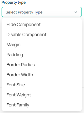
Action

Shows the list of actions and styles - the user can pick one of them, provide the corresponding value and click 'Apply Action' to see the result on the widget.

Action
Description

Hide Component

Sets whether the widget has to be displayed on the screen when the program is loaded. Value - true / false

Disable Component

Makes the widget read-only, and denies users any action over the element. Value - true / false

Margin

Set in terms of "px" number which creates the space between the border and the content of the widget.

Padding

Set in terms of "px" number which creates the space between the border and outer elements.

Border Radius

Sets the radius of the widget's corners, enabling rounded corners on the widget. This value is defined in "px" terms.

Border Width

Set the thickness of the border of the widget using this value. It is defined using "px" terms.

Font Size

Set the size of the text in "px" value - 12px

Font Weight

Increase or decrease the thickness of the font using the list of numbers from 100-800.

Font Family

Background Color

Set the background colour of the widget using the RGB range that can be picked from the paint box.

Border Color

Set the colour to the border lines, covering the widget.

Text Color

Set the colour for the text of the widget.

Type the name of the font family. The reference to the list of font families can be found here:

MDN web docs